There is nothing we label and packaging designers love more than discussing what makes a great design. We can go on for hours about typography, embellishments, color, brand story, product goals, sales drivers, convenience, sustainability – you name it. Such a discussion typically ends in declaring the packaging either a hit or a miss. I’ve rounded up some recent packaging hits and misses for those of you who have never been privy to such an exhilarating conversation. Feel free to share your thoughts (and your favorite hits or misses) on my LinkedIn profile.
1. Miller gives a whole new meaning to the word ‘Lite’
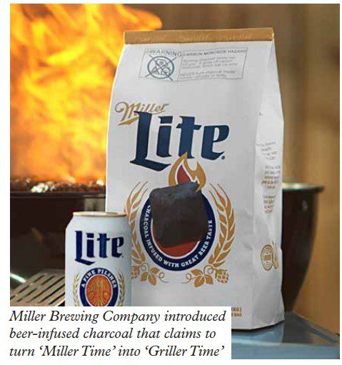
As a vegetarian, I am by no means a barbeque expert. But I loved this new product and its packaging from Miller Brewing Company because it makes perfect sense. Introducing beer-infused charcoal that claims to turn ‘Miller Time’ into ‘Griller Time.’ While I am not their target market, it’s clear that Miller totally gets their customer. Launched just before Memorial Day, Miller knows that summertime is beer time and grill time. From a design standpoint, this brand extension works. Miller Lite’s packaging still uses its classic logo and typography, and yet it feels refreshing and lite-hearted (sorry, I couldn’t resist!). It certainly stood out among all the classic black and red packaging on the charcoal aisle. Signs of a hit? The bags sold out as quickly as they could be re-shelved.
2. Two-in-one packaging
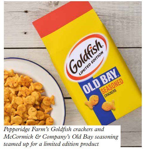
Pepperidge Farm’s Goldfish crackers and McCormick & Company’s Old Bay seasoning teamed up for a limited-edition product that quickly sold out online and flew off the shelves when it rolled out to retail. The two brands came together because they discovered that people have been sprinkling Old Bay seasoning on Goldfish crackers for years as an appetizer delicacy. So, they reasoned, why not give people what they want?
The two-brands-in-one packaging certainly works. The bag is redesigned in Old Bay’s signature colors of yellow, blue and orange and prominently features a large Goldfish logo.
That’s smart; the design combines the two strongest elements of the separate brands into one very attractive bag while losing none of the brands’ clout. I think this is a win-win.
3. Getting to the bottom of your product
Beauty products are notorious for pumps that makes it seem as if there is no more product in the bottle, but there definitely is. This one is my pet peeves! Last week, I cut open a bulk-size hair conditioner bottle, and scooped out four ounces of unused product. That’s half of the contents of a regular-size bottle! Have you ever done this?
We should never have to cut open a bottle, a tube or any packaging to get all of the product that we paid for. That’s just bad design. Not only that, it can be dangerous. Cutting open bottles and other packaging exposes products to the outside air and can speed up the oxidation of ingredients and promote the spread of bacteria.
4. Is Wesson’s new look borderline boring or simply brilliant? Maybe both.
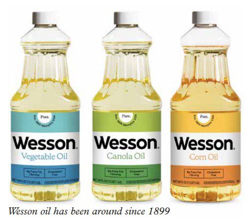
Wesson oil has been around since 1899, and according to independent retail data, it is America’s best-selling plant-based cooking oil. After buying the brand from Conagra, Richardson International launched a rebranding that is inspired by Wesson’s 123-year history yet feels fresh and current.
The packaging uses tri-colored labels and a soothing color palette; the rebrand colors correlate to each type of oil – canola, corn, vegetable, and best blend. The goal is to make it easy for shoppers to differentiate between the oils and pick the one they want. While the typography is not the same as Wesson’s previous and somewhat famous logotype (created by the legendary Saul Bass in the 1960s), it certainly is keeping with the nostalgic font feel.
Certainly, the design is minimalistic. Do you think it works, or is it borderline boring? (Or both?) It’s clean, easy to find and differentiate on the shelf; it maintains its heritage, gives a nod to the nostalgic,
and is part of a media campaign to attract Millennial and Gen-Z cooks and chefs. With the rising cost of food, the timing could not be better.
Of course, the true test comes when sales numbers are measured. How do you think it will perform? Most importantly, does the rebrand make you want to give Wesson another look? Because, after all, that is the point – to look, touch, pick up and purchase, all in just a few seconds.
5. Bad packaging isn’t just poor design – it can be dangerous!
I’m a big believer in responsible packaging. Design matters! Don’t think so? Recently I saw what I thought was candy and a bottle of water. Wait a minute – that was not candy! Those were naphthalene balls (commonly known as moth balls), and their brand name is Swallow. How did that ever get approved? The transparent packaging made the bright-colored balls look it look edible – NOT! And the ‘water’ bottle? That was actually clear glue! But it had a ‘water splat.’ Upon a closer look, that image is intended to inform customers that the glue is washable. Yikes! Complete confusion and it could be dangerous if ingested. Needless to say, these are examples of packaging design misses.
6. Designing a classic
Coca-Cola announced a huge brand shift earlier this year, re-designing the labels and packaging of its most popular soda flavors. Now every Coca-Cola flavor will have a new ‘modernized’ design meant to ‘quickly communicate flavors,’ according to the announcement in January. For example, single colors represent a single flavor (like Cherry Coke), while two-color designs represent flavor combinations (like Cherry Vanilla Coke). White logos mean a beverage is a regular, full-calorie flavor, while black logos mean the product is zero sugar, zero-calorie. So does the rebrand work for you, or do you prefer the ‘classic’ branding? (Pun intended!)
7. Who Gives a Crap?
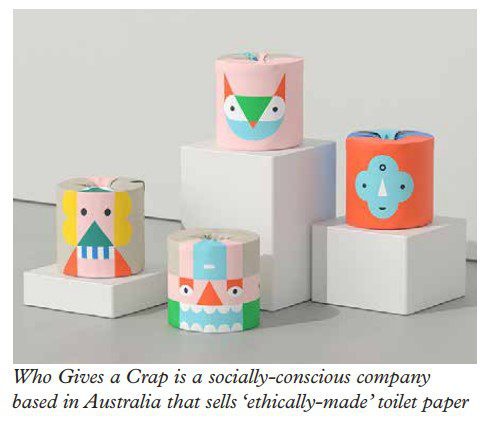
Who gives a crap? Well, it turns out, this toilet paper company does. According to its mission statement, Who Gives a Crap is a socially-conscious company based in Australia that sells ‘ethically-made toilet paper aiming to change consumption patterns and raise funds for sanitation projects in developing countries globally.’
To give its brand broader global awareness, Who Gives a Crap has rebranded to attract new customers outside of the Australian market. While the name is hilarious, the company is serious in its goal to provide access to toilets for people all over the world, donating 50 percent of its profits to building toilets for those in need.
The company continually updates its designs. Designed with kids in mind, a recent colorful, abstract packaging transforms typical plain white toilet paper wrappers with graphic shapes and colors depicting stylized people, animals and imaginary creatures. From the side, the wrapped toilet paper looks like large building blocks – something that children could totally play with before use, which is
what the design studio imagined.
I love this playful approach to design; it’s fun, bright and eye-catching. Plus, it’s very unexpected in this category. (I would say they could wipe up the competition with this design, but that’s going a little too far in the pun category, don’t you think?) If I saw this in the store aisle, it would stop me in my tracks – exactly the goal of packaging design.
8. Avoiding wrap rage
I realize that a brand’s packaging must protect its product and meet regulations. But when does packaging become too difficult to open? (When you grab the garden shears, but serious accidents do happen! Some people end up at the ER needing stitches or at the dentist with a cracked tooth when trying to open a package. Never use a sharp knife or your teeth to open a package.)
This is so common that there’s even a modern-day term for this: wrap rage. People get so frustrated when trying to open impossible packaging that they become super angry. The real question for us as
brand strategists and packaging designers is: how much rage does that person feel toward the brand because of their negative unboxing experience?
There needs to be design balance. Your product needs to be protected, even child-proof, but it doesn’t have to be Fort Knox. If you’re designing or producing packaging that requires garden shears and a blowtorch to get to the product, ask yourself, when this gets shared online, what kind of unboxing experience will it be.
9. It’s a whole new ballgame for Cracker Jack and Jill
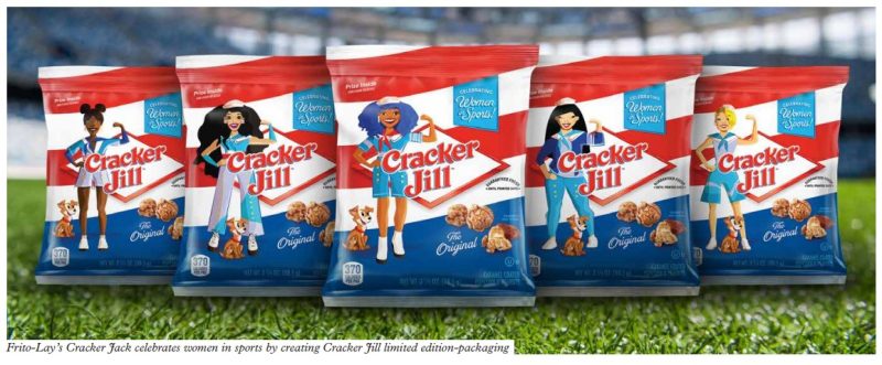
Frito-Lay’s Cracker Jack is celebrating women in sports by creating Cracker Jill limited-edition packaging. I love this! While similar to the original, the new bag design looks more youthful and contemporary. Its bold red stripes are flatter, and there’s a base of blue at the bottom. Each of the five new bags features a female dressed in the iconic sailor uniform; all five female images were designed to represent America’s diverse demographic. The bag has a fun, animated, super-hero(ine) vibe. The new bags were available at Major League ballparks this season.
Tina Mahal, VP of marketing at Frito-Lay NA, explained that the limited edition packaging is designed to honor women’s transformative role in sports and beyond – in every role they play – and everywhere where women have a seat at the table. Do you think the packaging supports the brand’s goal?


