

 CONNECT
 FOLLOW
 CALL
CALL
 EMAIL
EMAIL
Jif, Betty Crocker, and a dozen more brands update visual identities with bolder graphics and human-centric elements to stay competitive.
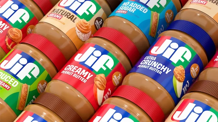
The stakes have never been higher at the grocery store, and this year many brands modernized their packaging to sharpen their shelf presence, update their visual identities, and better compete in a crowded retail landscape.
The two latest additions to the 2026 redesign club are Jif and Betty Crocker. Interestingly, the new looks don’t boldly reinvent the proverbial wheel; they lean into already familiar design cues.
After 30 years, Jif revived its signature tri-color banner, removing the dated drop shadow from the letters for a cleaner, bolder look. New imagery across the packaging also highlights more ways to enjoy Jif peanut butter throughout the day, keeping snack inspiration front and center. The brand also leaned into color-coded labels and lids to indicate different product varieties.
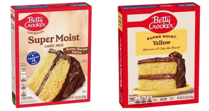
Betty Crocker’s design facelift is similarly subtle. Dubbed “Bettier than ever,” the new look brings its red spoon graphic front and center and reorients its nutritional tags to the bottom of the box, which helps put a better emphasis on updated product imagery.
Nostalgic elements with a modern twist
Jif and Betty Crocker join other heritage brands that also debuted new looks this year, including Glenfiddich, Manischewitz, Smucker’s, Bob’s Red Mill, Newtons, and 7Up. What made now the right time for change? Vicki Strull, president of Vicki Strull Design, says legacy brands innately know when it’s time to level up to appeal to more modern consumers.
“Shoppers may have grown up with legacy brands, but they don’t necessarily want to buy nostalgia,” she says. “They want modernized versions of the brands they grew up with; brands that feel like they have evolved with new health and wellness trends [and] these brands can no longer take for granted that shoppers will be loyal to them.”
Beyond winning on the shelf, packaging must also earn a place in the kitchen, too.
“It’s not very tempting to eat something that looks stodgy,” Stull says. “If a product looks fun and fresh in the home, on the kitchen counter, or in the pantry, we feel confident about our choice—it’s the old adage ‘look good, feel good.’”
After all, she continues, a package that looks and feels good can be part of why we reach for the same product again at the store instead of trying something new.
Trends point to balanced authenticity
The consumer pushback against AI is palpable, and brands are working to retain the human element in their packaging designs. Stull says that while so much of what we’re seeing online and in the real world is created by AI, shoppers want to know that a human was involved in creating what we eat and drink.
“When food is organic, it feels healthier [and] when a product is artisanal or handmade, it feels more genuine,” she explains. “People are becoming very savvy about what AI creates, and I think we’re going to see a stronger desire for things that feel distinctly human.”
Looking ahead, Stull predicts the impersonal feel of AI may give rise to the emergence of more “bespoke” packaging elements like hand-drawn type, illustrations, and other elements to help brands better communicate to their customers. “AI doesn’t feel special; it doesn’t feel like it’s speaking only to you in the way a bespoke design made by a human can,” she says. “Tactile or handcrafted elements can signal to the buyer that a human was involved in creating the product.”