

When every product is “high protein,” packaging design becomes the differentiator.

You’ve probably noticed that protein is having a moment on store shelves. Even I got in on the action (more on that later).
From high-protein cereals to Starbucks’ Protein Cold Foam, protein is showing up everywhere. Want a product to fly off the shelves? Highlight protein on the packaging.
But when an ingredient becomes the new “it” trend, differentiation becomes harder. How do you keep your product from blending into the protein pile?
Let’s unpack this.
Case in point: the protein yogurt wars!
Chobani and Oikos both sell yogurts with more than 20 grams of protein per serving, and protein dominates their packaging. What surprised me was how similar the designs are (see image above), particularly the main color of the tubs. Oikos has a black background, while Chobani has a very dark navy background, which can read as black in certain lighting. Both tubs have large vanilla flowers prominently displayed. In the yogurt aisle, it would be easy to grab the wrong one or forget which is your favorite. The designs are just too similar.
So, when I had the opportunity to redesign the packaging for the world’s first protein soda, Don’t Quit (later rebranded as SkyPop), standing out became a priority.
The challenge was twofold:
- Introduce an entirely new category: protein soda.
- Position SkyPop as an alternative soda appealing to a broader audience.
The solution to the first problem was surprisingly simple. I made “protein soda” more prominent in the design hierarchy than the brand name itself. Shoppers notice the category first, pause out of curiosity, and then discover the brand.
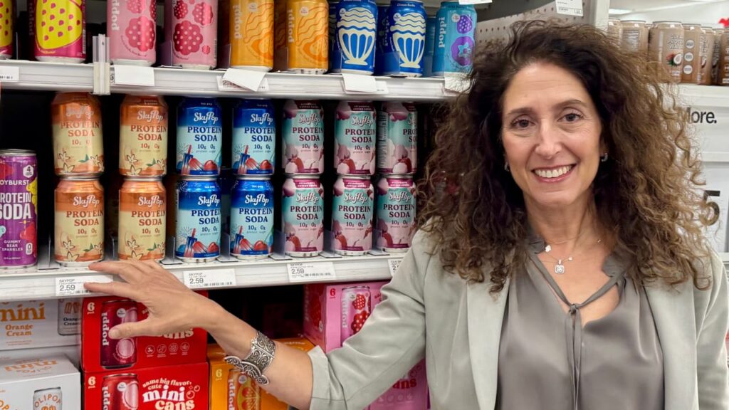
To move away from a protein recovery drink and into lifestyle territory, the brand needed a playful personality that could compete with brands like Poppi and Olipop (two prebiotic sodas). The target audience shifted to younger, health-conscious consumers who still want fun and function. The brand needed a visual identity with flair — a stark departure from its utilitarian roots.
I built the new design concept around gradations with large-scale “dancing” cherries, orange slices, grapes, pineapple, popsicles, and cotton candy to infuse the packaging with personality and flair. The new design embraces color, motion, and whimsy: fireworks bursting, foam floating, fruit flying! The identity added a touch of fantasy that speaks both to the new flavors and the broader audience of professionals, young parents, and fitness enthusiasts who want their protein with a side of joy.
My client loved it. More importantly, the retailers and buyers they pitched it to loved it, and SkyPop Protein Soda is now in thousands of stores nationwide with a unique positioning, layout, and design that differentiates it from the protein pack that is having its moment.