

… without alienating existing customers.
As a brand strategist, creative director, and packaging designer, I’ve spent more than 25 years helping both established global brands and emerging direct-to-consumer companies unlock the power of design and packaging to:
- Increase sales
- Create new revenue streams
- Build brand loyalty
- Integrate design into broader marketing strategies
- Translate visual and tactile design into measurable market impact
For me, few things rival a lively design conversation with fellow design and packaging enthusiasts, and that’s exactly the spirit I hope to bring to my Packaging Digest articles. Join me as I dive into topics such as:
- Crafting designs that amplify your brand’s story and forge genuine connections with your audience.
- Modernizing your brand without alienating your base.
- Creating unboxing experiences that protect the product while elevating the brand.
- Exploring design tools that shape perception, spark emotion, and foster lasting brand loyalty.
- Using sensory marketing to entice shoppers to engage longer with products and, even better yet, cause them to touch the product, which leads me to …
- Leveraging haptics in design. (Did you know that untouched is unsold? More on that later.)
Let’s begin with a family and game night favorite: pizza.
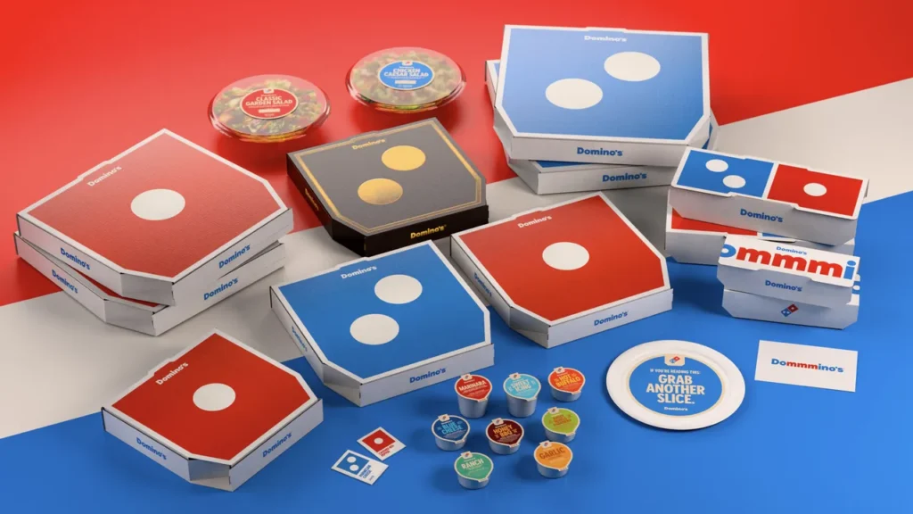
When a red square says “Pizza Night”
For many Americans, the Super Bowl will be their first glimpse of the fabulous brand refresh for Domino’s that debuted in October 2025 — whether from the promos leading up to the big game or eating it during the game.
The new branding includes:
- a sharper logo
- a brighter, richer color palette that translates better online and on their pizza boxes, a critical factor in today’s omnichannel marketing strategies
- a bold custom typeface called Domino’s Sans
- new graphics
What I love most about the rebrand is how boldly the new pizza box design radiates confidence. The old, busy designs have vanished, making way for a sleek, modern style. The Domino’s wordmark is small and subtle because the iconic red-and-blue dominoes instantly convey to customers which pizza they are about to enjoy. You don’t need to show pizza on your packaging when your brand iconography moves into Golden Arches territory, transcending the need for additional text or imagery.
In fact, their visual identity is so strong that they can communicate their entire brand story through a single image of half of a domino. That is a true design flex! Taken out of context, the red side of the domino is just a red square with a white dot, but when placed on a pizza box, even without the logo or wordmark, we immediately know it’s Domino’s. The domino is now a signature element of their brand — they own these shapes and are instantly recognizable as Domino’s, without a logo.
Best of all, Domino’s pulled off this transformation without losing loyal fans, staying true to its roots and building brand loyalty while connecting with a new generation. The design feels young and fresh, yet honors years of brand equity. They took what people already loved about Domino’s — the reliability of a hot pizza delivered on time — and went deeper. Adults love the new design because it feels familiar, tapping into their sense of nostalgia. Kids, teens, and young adults love it because it’s fun, playful, and shareable, proving that good packaging design can influence multiple demographics.
Let’s unpack this:
As a brand, you can modernize your look while avoiding negative public feedback. How? Follow Domino’s lead by balancing a sleek, modern identity with years of brand equity. Respect your audience and customers while leaning into what makes your brand special. Brands can do this simultaneously as they are cultivating new secondary audiences.
People naturally shift in and out of a brand as their life stage, passions, and priorities change. Winning brands stay tuned in to their audience and treat it like a dynamic balancing act, a constantly shifting seesaw.
And, most of all, don’t be afraid to have fun.