

Branding and design columnist, Vicki Strull, recounts a successful packaging redesign she completed for a food brand
All of us would agree that coming across a prospective client who asks, ‘How can you help my products sell better?’ is the holy grail of prospects. They already value your expertise and are ready to collaborate. Their packaging isn’t bringing in the anticipated revenue, or more importantly, as they forecasted for their stakeholders or investors. You may offer to add some bling with a metallic foil, increase the tactility with soft touch, or change the substrate to something smoother, shinier, or more recyclable. Often, those strategies will work, but other times, those recommendations in printing and finishing will not suffice. Instead, the packaging needs a rebrand to boost sales, captivate the audience, and move their products from the shelves to shopping carts.
Recently, I encountered a specialty food brand, Wildfare, whose packaging was lacking—an oversimplified design in pale colors with minimal finishing. In other words, the brand identity was boring, and the packaging was not just bleh; it was unappetizing—not good for a specialty food brand.
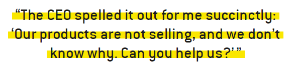
The CEO spelled it out for me succinctly: ‘Our products are not selling, and we don’t know why. Can you help us?’
Challenge accepted.
Wildfare clearly did not understand that the job of packaging is to scream off the shelf and grab a shopper’s attention, so
they will choose that product over all the other competitors in a matter of a few seconds. Likewise, it’s our job, as designers, marketers and packaging converters, to help brands create packaging that is compelling, tactile and designed to sell.
Shelf appeal
Across the board, the packaging appeared generic, with a marginal brand story on the primary display panel. In some cases, the existing packaging was outright unattractive. For example, Wildfare sells dried apricots that are sulfite-free. I’ve tasted them, and these apricots are soft, chewy, healthy and delicious. But they are also sticky, wrinkly and deep brown, so a window on the primary display panel is not the best choice to make the product appear appetizing. In other instances, SKU colors were so muted that the knock-out white type was illegible.
Functionally, the packaging wasn’t working either. By the time the products hit grocery store shelves, labels were peeling and showed wear and tear. On the flexible packaging, the logo overlapped the resealable zipper. And if that weren’t enough, the converter had not accounted for the off-gassing of dried fruit flex-packs, so packages were exploding in the warehouse and in stores.
Positioning
Wildfare has a compelling brand story. The founders are originally from Turkey, and their brand purpose is to bring timeless, delicious, and healthy staples of a Mediterranean diet to the US market to be savored every day. They pride themselves in sourcing and curating from small orchards and producers who employ culinary traditions dating back 3,000 years. However, none of that translated onto the messaging or visuals of its packaging. As I educated Wildfare on shelf appeal, brand purpose, positioning and messaging, I also learned that Wildfare positions its products as premium. Wildfare products are priced on the high end within each category—from olive oil and dried fruits to olives and various flavored bruschetta.
Audience
As I deconstructed the brand challenges, I needed to learn more about the audience. The CEO said that their target audience is health-conscious and adventurous eaters who are 20 to 40 years old. Hmmmm…Are people in their 20s buying $30 bottles of olive oil?
Listen, observe, learn
After these discovery conversations, I concluded: Wildfare is a brand that offers healthy, high-end specialty foods in banal packaging detrimental to their sales. Their current target audience of Gen-Z (20‑somethings) to young Millennials (30 to 40) doesn’t align with their more expensive prices. To compound these issues, Wildfare is neither communicating luxe nor why its products are special and deserve to be purchased at a premium. When it came to manufacturing its packaging, its converter seemed inexperienced and transactional, certainly not the type of relationship that creates meaningful and successful brand
partnerships.
Time to get creative
Up to this point in the rebranding process, I’ve been educating, researching and analyzing, but now it’s time for all of this discovery to inform my creative process.
Talking to your audience
We began by shifting the target audience. We eliminated 20-somethings and focused instead on Millennials, Gen-X and Boomers, targeting 35 to 65+ year-olds. These generations have more disposable income for premium-priced products. Additionally, while those with young children value healthy, organic foods for growing young bodies, those in the older generations appreciate the health benefits of a Mediterranean diet.
Messaging
To write the Wildfare story, we deeply explored semantics and perspective to develop a descriptive tagline focused on their customers and what they do. Using alliteration and imagery, the tagline ‘Proud Purveyors of Provisions of the Mediterranean Soil and Sun’ conjures depictions of the Mediterranean, orchards, growth and Wildfare as connoisseurs. Following that with a visceral brand story that includes phrases such as ‘culinary traditions dating back 3,000 years’ and ‘delicacies steeped in history and tradition’ adds to the richness of Wildfare’s story that will be complemented with the visual identity. Finally, ending each copy block on the packaging with ‘wildly irresistible Mediterranean fare’ punctuates the focus on tantalizing customers.
Make your mark
Once our narrative was established, I moved on to visual storytelling. When I’m designing a brand identity, every detail is imbued with meaning. As a curator of imported foods steeped in history, I was delighted to find the typeface Surveyor, which is derived from historical engraved maps. I paired that beautiful classic serif font with a sans serif ‘workhorse’ typeface, Whitney Narrow, that was developed to be legible even at the smallest point sizes – which is a must when designing food labels.
To design the logotype with Surveyor, I morphed pieces of the upper- and lower-case ‘w’ with the dot of the ‘i’ to create a unique ligature that sets a thoughtful tone for the brand.
To create the mark that would accompany the logotype, I became energized by the Mediterranean culture and heritage: intricate mosaic patterns from the region; the delicate lacework stucco of the Alhambra, which I had recently visited; and bird, sun and tulip motifs, where I discovered that tulips originated in Turkey.
The color palette emerged organically, as I based it on the Mediterranean Sea, with its myriad shades of blue, depending on the time of day, how deep the water is, and whether the sun is glinting off the waves. From deep, rich purple, reminiscent of eggplant—a staple in Mediterranean cuisine—to colors of the sky, sunrise to sunset, and even the dark mysteries of the midnight hour, all are included in the color palette. Wildfare’s color palette is now evocative, sophisticated and unexpected.
As I began to play with shapes, monograms and symbols, I mixed and matched colors, layered designs, and refined the concepts. Some of the icons looked flat, while others had movement. We finally settled on a logo that combines a flower and the sun in the form of a mosaic. Our Wildfare mosaic flower brings the narrative story to life visually.
Packaging a rebrand
With the brand identity as a cornerstone, the next step was to redesign the packaging, Wildfare’s original request. I designed five foundational templates to establish the basis of more than 100 SKUs:
1. A vertical label on their flagship product—olive oil
2. A horizontal label for a shorter jar
3. A flex-pack for dried fruits
4. A folding carton for pasta
5. A wrapper for a granola bar
Thinking about the design existing in a retail environment next to Wildfare’s competitors informed how I applied the new identity to these various formats, shapes and sizes.
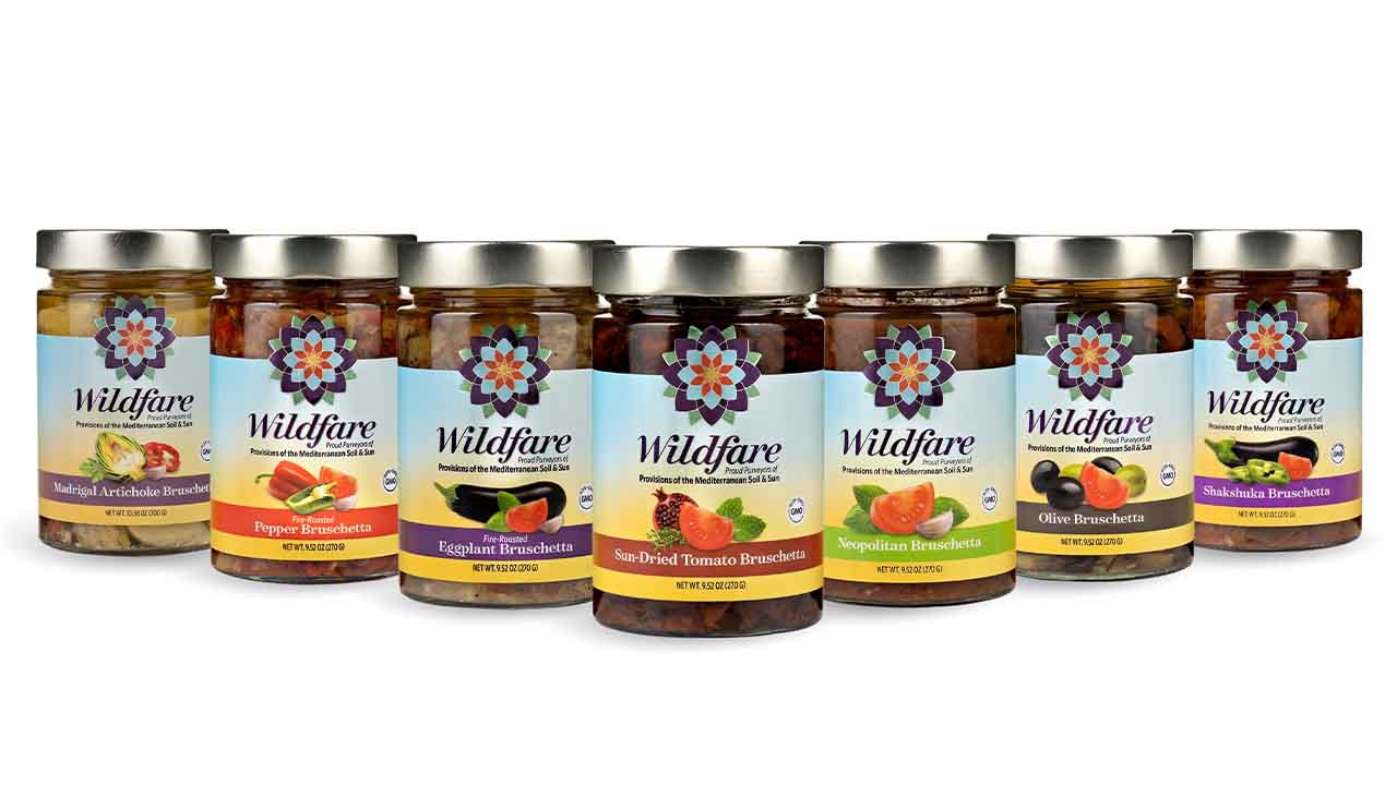
The background on the labels and packaging is a warm sunrise progressing into a beautiful blue sky, evocative of the Mediterranean. Anchoring every primary display panel is Wildfare’s mosaic flower, representing the sun since every product in the Wildfare line relies on the sun. This prominent unique mark becomes instantly recognizable and differentiates Wildfare from its competitors.
Finally, the window problem of dried fruit was solved with photographic compositional fruit imagery in its most appealing form—freshly picked.
A converter’s turn to make it shine
While the graphics are meaningful, the colors are intentional, and the typography is legible, even the best designs are incomplete without vigilant production and finishing. We know the most successful brands appeal to our haptic brains with textures that encourage us to pick up those packages. High-quality 4-color printing, embellishments, coatings, and finishing were essential to complete Wildfare’s rebrand. Metallics add shine to the mosaic flower. With 50 percent white under 4-color printing on a metalized film, we achieved just enough shimmer on the gradient, and the tactile spot gloss on the fruit imagery and logotype added a subtle contrast to the soft, dull varnished background.
With the rebrand complete, we applied the new designs to more than 100 SKUs. We began with a brand struggling to sell its products due to dull packaging and a lack of effective messaging. Through careful analysis, creative exploration, and a deep understanding of the new target audience, we transformed Wildfare’s packaging into a captivating and compelling visual story.
The result? Packaging and a brand identity that now reflects the brand’s purpose and premium products. To date Wildfare has expanded sales from the limited tri-state area on the east coast to the Midwest and west coast.