

 CONNECT
 FOLLOW
 CALL
 EMAIL
What happens when a popular online brand wants to break into mainstream supermarkets? The packaging must change. Two case studies show how.

The CEO of Wildfare spelled it out for me: “Our products are not selling, and we don’t know why. Can you help us?”
The problem? Wildfare packaging was designed for direct-to-consumer (DTC), but it wasn’t working at retail. The product was premium, but the packaging was uninspired and, in some cases, unattractive.
It’s one thing to promote a brand on a website, an Amazon storefront, or social media. But it’s another when the package is sitting directly next to its competitors in a crowded category.
For instance, Wildfare sold organic sulfate-free apricots. It could promote that benefit online without ever showing the package. It’s a different story on a store shelf because their packaging had a window that let customers see these premium apricots. Problem? Organic, sulfate-free apricots are not attractive: They’re wrinkly, dark brown, and not very appetizing. When shoppers scanned the shelves, they didn’t see a sulfate-free product that tastes better and is better for you. They saw an ugly lump of brown apricots and kept scanning.
Wildfare’s jars of olives had a similar issue. Its flagship olive oil was less offensive but no less uninspired.
My challenge with Wildfare was to transform packaging that felt generic and ho-hum into a distinctive brand that stood out on the grocery-store shelf.
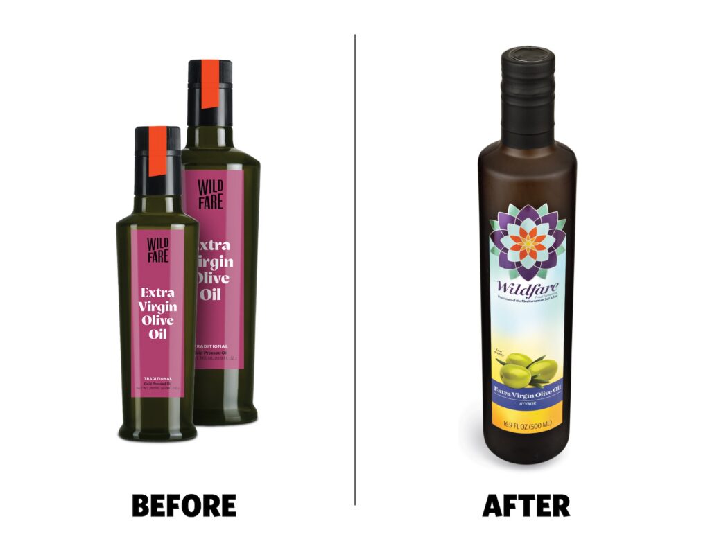
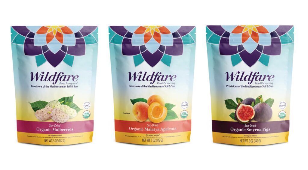
- First, we leaned into the brand’s Mediterranean roots. The logo evolved from a logotype that appealed to 20-somethings into a mark that was both a sun and a flower, inspired by Mediterranean mosaics.
- We reworked the typography into something more classic by pairing Surveyor, inspired by ancient Mediterranean maps, with the highly readable Whitney.
- A new Mediterranean color palette in blues, deep eggplant purple, and sunrise-to-sunset hues was used to reinforce the Mediterranean origin.
- Most importantly for the packaging, fresh fruit imagery replaced the unappealing dried fruit visible through the original pouches.
- Reworking the packaging hierarchy, the new sun icon was front and center, making any stock-keeping unit (SKU) unmistakably Wildfare, regardless of the category, and helping Wildfare gain market share.
- To achieve a premium look and feel, we manufactured labels on metallic film. We used opaque white with matte and gloss finishes to create a sophisticated shimmer and texture that justified its premium-tier pricing.
Better branding and shelf appeal
Wildfare’s situation is not an isolated one. Surreal had a similar challenge, but from an entirely different angle. Its high-protein cereal was a wildly successful DTC brand. Super fans ordered the cereal because they wanted a high-protein option.
-
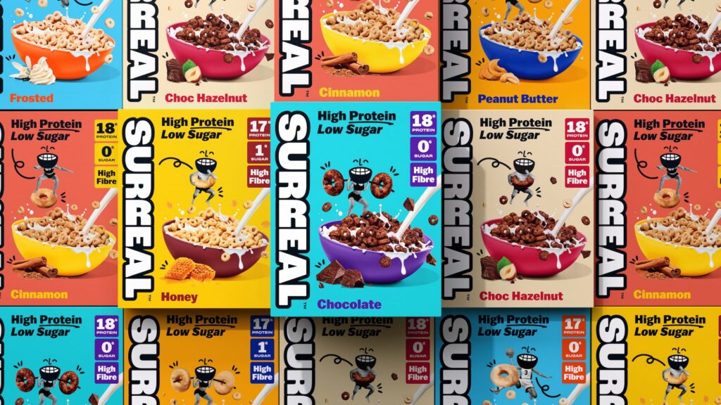
The logo was moved from the right side of the pack to the left and redrawn with white letters on a black outline to improve visibility and create a subtle “milk” nod.
-
The messaging hierarchy was improved, with the “high protein, low sugar” claim more prominent and new flavor visuals that put taste front and center.
-
The color palette was tweaked across the range for better shelf distinction, and the typography was refined for legibility in a busy retail setting.
-
The back-of-pack copy retained the playful, adult-humor tone, keeping the brand voice alive.
Surreal and Wildfare approached this challenge from different directions but reached the same conclusion: Their packaging needed to work harder on the grocery-store shelf.
Whether you’re taking a successful DTC brand like Surreal into retail or repositioning a premium brand like Wildfare, what works online doesn’t necessarily work for grocery-store shoppers.